A deep dive into how we can improve gradient utility classes in TailwindCSS
20 April 2024
40 min read
Note: a lot of this blog is obsolete with the release of Tailwind CSS v4. Not only does it provide first-class support for a lot discussed in this blog, but the plugin development described below seems to have been depreciated in support of a CSS-first approach. I may update this in the future to reflect that.
For those unfamiliar, TailwindCSS is a CSS framework that allows developers to write using utility-first classes. A developer may typically write a card like <div class="calendar">...</div>. The .calendar class would then have a long list of CSS properties that style the div. With TailwindCSS, that div may look something like:
Each of those classes usually represents a single CSS property. bg-zinc-100, for example, sets the background-color property to a light, muted blue. p-4 sets the padding of the element to 1rem. Tailwind gives us a neutral set of classes, which we can use to craft components. I personally love Tailwind—nearly any web project beyond a small prototype uses Tailwind.
Tailwind is definitely polarizing. We don’t need to swap between HTML and CSS files, however, it’s easy to fill elements with a ridiculous number of classes. Like, One of the elements on this blog literally looks like this:
Yeah… holy smokes (•_•)!! I can understand why a pretty nasty element like that can be pretty cumbersome and off-putting to someone unfamiliar with the syntax. By being utility-first, Tailwind confronts the standard way we write CSS. It’s different, no doubt, but I think it’s a little easy to conflate different or verbose with bad and unmaintainable.
I personally find Tailwind to fall a little short in a few places—and I think the way that Tailwind handles gradients is in sore need of a revisit. So, in this post, we’ll do exactly that! We’ll work with the Tailwind plugin API to improve and extend the existing set of utility classes that Tailwind provides to deal with gradients.
By the end of this very lengthy post, we will have:
A good understanding of how Tailwind handles gradients, and where it falls short
Knowledge of how W3C defines a gradient, and how to read W3C syntax
An introduction to Tailwind plugins by generalizing the linear-gradient() direction utility classes
A review of color interpolation methods, and how we can implement a set of utility classes to handle them while respective progressive enhancement
A deep understanding of how the linear-gradient(), radial-gradient(), and conic-gradient() functions all differ from one another, and how we can further extend our gradient plugin by adding support for the latter two.
It’s a long post, so let’s jump in! ᕕ( ᐛ )ᕗ
How Tailwind handles gradient
Currently, Tailwind CSS supports a pretty limited number of solutions when it comes to creating utility-based gradients. Gradients are defined with a series of classes in the background-image utility:
bg-gradient-to-*: this adds the background-image property to our element, and—based on the class— specifies the direction of the gradient.
from-*: Our first gradient stop. This can be written to specify a color as from-<color>. We can optionally add a from-<percentage> class, which tells us where along the gradient the color stop is located.
via-*: The middle gradient stop. This utility has the same forms as from-*.
to-*: The final gradient stop.
A Tailwind gradient assumes the from-*, via-*, and to-* stop colors to be transparent, so we only need to define one color stop. Defining a gradient in Tailwind utility classes can be as complex as:
However, this misses out on a lot of functionality. Let’s take a peek at how the linear-gradient() function is defined.
How are gradients really defined?
The W3C is the body that writes the standards for the web. These standards tell browsers and developers the expectations for everything that makes the web what it is: HTML, CSS, Web APIs, accessibility, internationalization, etc.
When it comes to CSS, the W3C has a standard way of writing syntax. Syntax tells us how things in CSS can be written validly. For example, the syntax of the <color> type is:
The bar (|) combinator tells us that a valid color can be either <color-base>orcurrentColoror a <system-color>. A valid <color> could be hsl(35deg 100% 50%) because that’s a valid <color-base>, but values like #a, woofdog, or superDeepPurple are not valid.
The <linear-gradient()> type tells us how we can write a valid linear-gradient() function:
Looks a bit complex! We can break this down piece by piece though. We can first note the grouping brackets ([ ]) that surround the first chunk, followed by the question mark (?). This tells us that everything inside the brackets ([ <angle> | to <side-or-corner> ] || <color-interpolation-method>) is optional.
Inside these first set of brackets we have the following:
[ <angle> | to <side-or-corner> ] || <color-interpolation-method>
The double bar (||) tells us that we can have one or more of the options on either side of it. We can think of it as the option combinator: we can pick multiple components if we want and add them into the mix. We can include just one portion of this syntax, like [ <angle> | to <side-or-corner> ] or <color-interpolation-method>, but we can also include the whole thing. An example linear-gradient() function might be:
linear-gradient(35deg in oklab,/* ... */);
The 35deg satisfies the [ <angle> | to <side-or-corner> ] syntax, and the in oklab satisfies the <color-interpolation-method> syntax.
On the left side of this double bar (||) is another set of brackets that enclose <angle> | to <side-or-corner>. Here, the single bar (|) combinator tells us that we choose only one of the components within its scope. In this case, we can choose either an <angle> (like 35deg) or a to <side-or-corner> component (like to top left).
There’s a lot to it, but reading the syntax isn’t too bad, I promise! (ノ◕ヮ◕)ノ*:・゚✧
Ultimately, there are a few general components to focus on:
The direction of the gradient line ([ <angle> | to <side-or-corner> ]): We can think of a linear gradient as interpolating (changing colors) over a line—the direction of the linear gradient tells us the rotation of that gradient line (0deg points upwards).
This component defaults to to bottom, meaning the gradient starts at the top of the element, and interpolates towards the bottom of the element.
The color interpolation method (<color-interpolation-method>): This essentially tells us how the gradient interpolates between two colors. We’ll cover this much deeper later!
My understanding is that this component defaults to in oklab, but it seems like some browsers actually use in srgb (don’t worry it isn’t super important to know what this means right now).
The color stops (<color-stop-list>): This is a list of colors and percentages, which defines the colors the gradient interpolates between, and over what portion of the gradient we interpolate between two colors. The <color-stop-list> syntax is defined as:
We won’t dive too deep into this, but in general, this syntax allows us to define as many color stops as we want. The <linear-color-stop> type allows us to specify a color and up to two <length-percentage> types (these are either a length, like 50px, or a percentage, like 10%). These two <length-percentage> types specify the start and end of where the specified color is solid (i.e. where it doesn’t change at all).
After we define one color stop, we can define zero or more [ <linear-color-hint>? , <linear-color-stop> ] groups. A <linear-color-hint> tells us where the interpolation between the previous color hits its “halfway point”. Take the following linear-gradient() function:
background:linear-gradient(red, 20px, blue);
This tells us that the gradient starts at red at 0px, interpolates halfway towards blue by 20px, and then interpolates to blue until the end of the gradient.
The group also tells us that we specify another <linear-color-stop>, which takes the same form as the first. This syntax allows us to build out an indefinitely long list of color stops. I don’t want to dive too deep into this, because it’s surprisingly complex for a tiny part of syntax within a larger whole.
Where does Tailwind Fall Short?
So, we know a bit more about every part of the linear-gradient() function. But where does Tailwind fall short?
In Tailwind, we first define a gradient with one of the bg-gradient-to-* utility classes. the asterisk is just a stand-in, and this stand-in can be one of eight directions: t, tr, r, br, b, bl, l, and tl. These shorthand properties correspond to one of the valid <angle-or-corner> data types.
After we define a gradient, we can use the from-*, via-*, and to-* utility classes to define the initial, middle, and end color stops (and their respective positions).
For example, we may use the following Tailwind utility classes to define a gradient:
But this is essentially as complex as we can get! We could define a middle point, but that’s pretty much it! We’re missing a bit here:
The direction is restricted: we can choose an <angle-or-corner> (like bg-linear-to-t), but can’t use any <angle> type (for example, we can’t do anything like bg-gradient-to-[35deg]).
We can’t specify any interpolation method: Tailwind’s set of utility classes for gradients doesn’t give us any access to change how the gradient interpolates between two colors. For 95% of cases this is no big deal, but we should have access to this, right? There are small—but noticeable—differences between an interpolation in sRGB and an interpolation in LAB!
We can’t change the gradient we’re using: beyond linear-gradient(), CSS also has radial-gradient() and conic-gradient() functions. We’ll dig into how these gradient functions differ later in this post—the thing to note here is that Tailwind has no way to access these (outside of an arbitrary property class like [background-image:conic-gradient(...)], which is pretty cumbersome).
We can’t specify more than three color stops: The syntax for <color-stop-list> allows us to define as many color stops as we want, however, we’re restricted to only three.
We won’t cover this last missing detail in this post, however. I generally think three color stops are fine for nearly any gradient, and the syntax of <color-stop-list> is pretty wacky. How would Tailwind theoretically even handle the potentiality of infinitely many color stops???
The first three issues are fair game though, and adding support for them with Tailwind-like syntax is the main focus of this post!
Improving gradient directions
The preexisting bg-gradient-to-* utility classes only support the <side-or-corner> data type, so we only direct our gradient in one of these eight directions. This is fine for most purposes, however, there’s nothing wrong with adding support for a more granular set of classes that support the <angle> data type.
Tailwind has some default rotation mappings through the rotate theme property. For example, 12 corresponds to 12deg. This property would then be used to generate a set of utility classes, like rotate-*. When we then add, say, rotate-12 to an element, we get the generated CSS declaration rotate: 12deg.
Tailwind’s matchUtilities() plugin function allows us to register a bunch of utility classes at once, by mapping keys and values to utility class names and generated properties, respectively:
With this improvement, we automatically gain a bunch of new utility classes for every key/value pair in the rotate theme. A dev can even extend or modify this theme property…
…and we’ll automatically generate a corresponding bg-gradient-to-77 class! A side benefit of this is that we can use the arbitrary value bracket syntax to specify gradients with any angle we want:
<!-- Tailwind-provided named direction class --><divclass="bg-linear-to-r"></div><!-- angle class --><divclass="bg-gradient-to-75"></div><!-- angle class: arbitrary value--><divclass="bg-gradient-to-[37deg]"></div>
Just for completeness, here’s the full list of the linear gradient angle utility classes and their generated class properties:
The <color-interpolation-method> data type is a relatively new addition to gradient functions. With this new data type, we can specify the color space **that the gradient will use to interpolate between colors.
What are color spaces, even?
Color science is a deep topic, so we won’t dive too deep into it here. A color space is essentially a method of arranging and describing these colors. For example, sRGB allows us to specify a color using three values—one for red, one for green, and one for blue: color: rgb(98, 244, 230);
Different color spaces give us different ways of accessing colors and have different pros and cons. sRGB, for example, isn’t perceptually uniform: changes in hue appear to differ wildly in apparent lightness and saturation. Something like Oklab, on the other hand, is perceptually uniform: changes in hue appear to have the same lightness to them.
This is highly relevant when it comes to gradients since these are all about moving around a color space! If we interpolate from one color to another in sRGB, we aren’t guaranteed a perceptually uniform result across the gradient (notice the muted colors in the middle):
But, a gradient that uses a perceptually uniform color space (like Oklab) doesn’t have this issue:
The difference is subtle. Notice the muted colors in the middle of the sRGB gradient and the more vibrant colors in the middle of the LAB gradient. Because LAB is perceptually uniform, the gradient appears to be more consistent in terms of lightness and saturation.
I’m not an expert on this at all. I develop more frequently than I design, so I don’t exactly have that precise designer eye. What’s worse is that I’m not even well versed enough in the intricacies of color gamuts and spaces to build a neat tool to visualize any of this! Luckily, other people have already done a better job at this than I could probably ever do (^-^)
Adam Argyle’s High Definition CSS Color Guide is the guide when it comes to color spaces and CSS (and is relevant to a lot of what we talk about in this section). I also highly recommend Eric Portis’ [incredible write-up on color spaces](https://ericportis.com/posts/2024/okay-color-spaces/), which delves into a lot more into the science and history of color theory. For an amazing visual tool, Isaac Muse’s interactive ColorAide color space viewer is unbeatable. It allows you to map different color gamuts to color spaces (including a ton of spaces not natively available on the web).
How color spaces are specified in gradient functions
The syntax of <color-interpolation-method> is:
in [ <rectangular-color-space> | <polar-color-space><hue-interpolation-method>? ]
We have two options here. On one hand, we can choose a rectangular color space (which we access with three linear axes):
On the other hand, we can choose a polar color space (which we access with two linear axes and a “rotation”). If we choose a polar color space to interpolate our gradient with, we can optionally choose a hue interpolation method, which tells us how we want to rotate around the color space to interpolate from one color to another.
Interactive: The effects of <color-interpolation-hue>
Drag the A and B sliders to see how different hue interpolation
method affect interpolating colors through polar color spaces!
90°0°270°180°
A
B
WARNING: You seem to be using a browser that currently doesn't support <color-interpolation-hue>. The output
gradient in this interactive will not be accurate!
We can use the handy tool below to see how a given color interpolation method differs from the one the browser ships with. Note that, as of writing this, Firefox does not support this new gradient syntax… this tool does progressively enhance so it should work automatically as soon as Firefox supports gradient interpolation methods ^_^
Interactive: Compare color interpolation spaces!
Use the options below to compare gradients across color spaces! The top
gradient is your browser's default interpolation method (it seems like
this is usually srgb).
Default browser interpolation
srgb
WARNING: You seem to be using a browser that currently doesn't support <color-interpolation-hue>. The output
gradient in this interactive will not be accurate!
The differences are subtle, but they matter! A gradient interpolation through srgbmight look pretty different (i.e. worse) when compared to one interpolated through lab or oklch. Tailwind currently ignores the <color-interpolation-method> entirely, so we don’t have a way to easily specify any color interpolation space. We can support this cool feature, but there are a few things we need to note:
We need to be able to target the default bg-gradient-to-* utility classes. The direction classes (e.g. bg-linear-to-r) that Tailwind provides by default aren’t defined in the same place as our custom, <angle>-based utility classes. If we don’t figure out how to target these default classes, we’ll end up unnecessarily splintering support for interpolation methods across Tailwind classes, which would be pretty nasty!
We shouldn’t force any interpolation method by default. The W3C does specify oklab as the default color space interpolation, however this isn’t followed in practice. For example, a linear-gradient() function in Chrome will default to interpolation in srgb if no color interpolation method is provided.
We need to account for browsers that lack support. Firefox, for example, currently doesn’t support the new linear-gradient() syntax, so we can’t use color interpolation methods. Firefox doesn’t have a graceful fallback either, so we need a linear-gradient without any <color-interpolation-method>.
So, in the previous section, we registered a bunch of <angle>-based utility classes. To support color interpolation methods, we can modify this a little bit.
Overriding Tailwind’s default classes
We could modify the function we wrote earlier to accept interpolation methods, however, we wouldn’t see this new functionality reflected in the default, 8-way bg-gradient-to-* functions that Tailwind provides by default, since we only target the rotate property.
To remedy this, we can define a custom theme property. We’ll call it gradientDirections. In this property, we’ll define our 8 possible values with the <angle-or-corner> data type, along with the theme’s rotate property:
exportdefault{// ...theme:{gradientDirection:({theme})=>({// <side-or-corner>t:'to top',tr:'to top right',r:'to right',// ......theme("rotate"),}),},// ...}
Then, we can slightly modify our matchUtilities() function to use the gradientDirection theme property, rather than the rotate property:
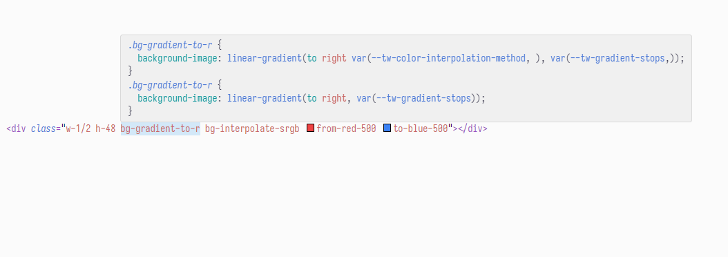
There’s a slight problem, though. This… works… however Tailwind’s directions gradient classes are actually defined under the backgroundImage property. Because we’re registering our custom gradient classes under a custom gradientDirection property, Tailwind can’t see that there are technically two class definitions:
bg-linear-to-t: where t is a property in backgroundImage (Tailwind’s default)
bg-linear-to-t: where t is a property in gradientDirection (Our custom)
Because this isn’t visible, Tailwind ends up generating two class definitions for directional gradient classes. Check out the hover preview for one of these directional gradient classes:
This isn’t technically a problem, but DX is always a nice thing, and conflicting CSS rules can be unnecessarily confusing.
Why not just extend the backgroundImage property with rotational values? It’s a good thought, however, if we dive into Tailwind’s source code, we can see that the gradient classes are defined as static utilities, which means they are meant to not be :
Another issue is that backgroundImage already handles some arbitrary values. Besides the directional gradient classes, backgroundImage also registers:
bg-none: which sets the background-image property to none (pretty self-explanatory lol)
bg-[*]: an arbitrary value class that allows us to set an element’s background-image property to a resource defined with something like a url() function.
Now, we can specify a data type to match an arbitrary value, so we don’t accidentally create arbitrary value classes with the wrong data type:
matchUtilities({"circle":(val)=>{return{"width": val,"height": val,"border-radius":"50%",}}},{type:"length",// only accept lengths: 5px, 4rem, etc.});
The showstopper here is that the <angle> data type is, for some reason, not listed here! We have no way to differentiate arbitrary values such that an <angle> maps to bg-gradient-to-* and everything else to bg-*.
Luckily, we can solve this annoying issue. Tailwind allows us to disable core plugins, which are essentially sections of the Tailwind library. backgroundImage, for example, is one such core plugin. We’ll disable that:
This removes the bg-none and bg-* classes, so we’ll need to reregister those. We’re essentially going to take control over generating the backgroundImage classes. We’ll redefine onlynone in the theme’s backgroundImage property:
Then, we’ll register this backgroundImage property as a set of dynamic utilities, so we can also get the arbitrary value support. We need to make sure we restrict the type of arbitrary values we accept here, since bg-[*] can also represent an arbitrary background-color utility, like bg-[#ff00ff] (these arbitrary classes are defined under the backgroundColor plugin, so we don’t need to worry about losing background-color utility support when we disable the backgroundImage plugin).
<!-- this should generate "background-color: #ff00ff;" --><divclass="bg-[#ff00ff]"></div><!-- this should generate "background-image: url('/img/logo.svg');" --><divclass="bg-[url('/img/logo.svg')]"></div><!-- this should generate "background-image: linear-gradient(to right, red, blue);" --><divclass="bg-[linear-gradient(to_right,_red,_blue)]"></div>
We can register arbitrary backgroundImage utility classes with:
a url: a url() function that specifies a resource
an image-like: this could be a linear-gradient(), radial-gradient(), etc.
So, to ensure we only register the right arbitrary backgroundImage utility classes, we can use the type option in the matchUtilities() function to accept the url and image types:
With this, we have every bg-gradient-to-* utility class under our control, and can move on to adding support for interpolation methods!
Adding support for interpolation methods
There are several types of interpolation methods that we could use; we can control this with a simple CSS variable. We don’t want to initialize this variable to some default, since we know there isn’t a default color interpolation method that browsers use (it should but oklab, but isn’t). The CSS var() has special syntax that allows us to define a fallback:
.gradient{background-image:linear-gradient(to right var(--interp-method, in oklab), red, blue);}
We can leave this empty, which will give us an empty fallback:
.gradient{background-image:linear-gradient(to right var(--interp-method,), red, blue);}
We’ll say that --tw-color-interpolation-method sets the color interpolation method for our gradient. We can pretty easily update the syntax in our original matchUtilities() function:
By default, -tw-color-interpolation-method isn’t defined, and our gradient interpolates in the default color space. To change this variable, we can override it in a separate set of utility classes. Since these are static and we don’t want the user to be able to define their own arbitrary values, we can use the addUtilities() plugin function, which allows us to define static utilities we don’t want the user to be able to change.
Earlier, I briefly mentioned rectangular and polar color spaces. We’ll store these color space names in their own arrays, and then iterate through these arrays to generate a set of static utility classes:
const rectangularSpaces =["srgb","srgb-linear","lab","oklab","xyz"];const polarSpaces =["hsl","hwb","lch","oklch"];for(const space of[...rectangularSpaces,...polarSpaces]){addUtilities({[`.bg-interpolate-${space}`]:{"--tw-color-interpolation-method":`in ${space}`,},});}
Any given polar color space can optionally have one of four interpolation methods, so we need to account for this. We can tap into the existing / syntax in Tailwind, which seems to be used most frequently in “optional specifiers.” For example, we can set an element’s color using color-blue-500, but we can optionally specify an opacity for that color using the / syntax: color-blue-500/50. Another place this is used is when we need to optionally specify a unique identifier for a group or peer class: group/card. I think this syntax is a great way to support relevant and optional information in a concise format, so we’ll shamelessly plunder it.
Like, there really isn’t a need for an entire set of utility classes just for hue interpolation methods:
We’ll loop through just the cylindrical color spaces, and add some more static utility classes to cover the optional <hue-interpolation-method> data type:
for(const space of polarSpaces){const hueInterpMethod =["longer","shorter","increasing","decreasing"];for(const interpMethod of hueInterpMethod){addUtilities({// we escape the "/" with "\\"[`.bg-interpolate-${space}\\/${interpMethod}`]:{"--tw-color-interpolation-method":`${space}${interpMethod} hue`,},});}}
With this, we have a really nice expanded set of classes we can use to better control our gradients :D
<!-- rectangular color space interpolation --><divclass="bg-linear-to-r bg-interpolate-oklab from-red-500 to-blue-500"></div><!-- cylindrical color space interpolation --><!-- this is visually equivalent to using the "shorter hue" <hue-interpolation-method> --><divclass="bg-gradient-to-[50deg] bg-interpolate-hwb from-red-500 to-blue-500"></div><!-- cylindrical color space interpolation: with <hue-interpolation-method> --><divclass="bg-gradient-to-[27deg] bg-interpolate-hwb/longer from-red-500 to-blue-500"></div><divclass="bg-gradient-to-12 bg-interpolate-hwb/shorter from-red-500 to-blue-500"></div><divclass="bg-linear-to-bl bg-interpolate-oklch/increasing from-red-500 to-blue-500"></div><divclass="bg-linear-to-r bg-interpolate-oklch/decreasing from-red-500 to-blue-500"></div>
Adding browser fallbacks
However, there’s one more problem we need to take care of! Some browsers, like Firefox, currently don’t support this new syntax. Gradients with a specified color interpolation method wouldn’t even render on browsers that don’t support the new syntax.
We could test to see if the browser is Firefox with the following @supports() CSS function:
@supports(-moz-appearance: none){/* ... */}
But this isn’t very graceful, since we would need to manually remove this once Firefox gets support for the new syntax. Any other browser without support for this syntax would also have to be included with its own @supports rule. Instead of trying to capture every since browser that doesn’t support the new gradient syntax, we can instead test for browsers that do. In other words, we don’t bother implementing a graceful fallback; rather, we implement progressive enhancement.
With this, we can change our theoretical @supports CSS function. If we want to see if the browser supports interpolating in srgb, we can just check if the corresponding background-image declaration is valid:
Tailwind’s utility registration functions are really flexible in how we register new class rules since a CSS rule is represented as an object, and we can represent an at-rule and its relevant CSS rules as a nested object. We can modify both of our addUtilities() functions to support this progressive enhancement:
const rectangularSpaces =["srgb","srgb-linear","lab","oklab","xyz"];const polarSpaces =["hsl","hwb","lch","oklch"];// Add classes for default rectangular and cylindrical spacesfor(const space of[...rectangularSpaces,...polarSpaces]){addUtilities({[`@supports (background-image: linear-gradient(in ${space}, red, red))`]:{[`.bg-interpolate-${space}`]:{'--tw-color-interpolation-method':`in ${space}`,},}});}// add optional variant classes for polar color space interpolation methods that// *also* specify a hue interpolation methodfor(const space of polarSpaces){const hueInterpMethod =["longer","shorter","increasing","decreasing"];for(const interpMethod of hueInterpMethod){addUtilities({[`@supports (background-image: linear-gradient(in ${space}, red, red))`]:{[`.bg-interpolate-${space}\/${interpMethod}`]:{'--tw-color-interpolation-method':`in ${space}${interpMethod} hue`,},}});}}
And, hey! That’s actually all there is to it! With that, we have a really robust set of utility classes that allow us to specify the color interpolation method for our gradients. The best part is that these progressively enhance, so browsers that don’t currently support the new gradient syntax will automatically support these utility classes when they gain support—no library update required!
Implemented color interpolation method utility classes and generated CSS properties
Tailwind class
Generated declarations
bg-gradient-to-*
background-image: linear-gradient(<dir> in var(--tw-color-interpolation-method, ), var(--tw-gradient-stops,));
With our improvements, we’ve implemented essentially every feature available to us in a linear-gradient() function. These improvements give us granular control when it comes to defining linear gradients… but what about other gradients? If we want to support a conic gradient, for example, we need to either use square bracket notation for an arbitrary property…
Besides this being cumbersome, we also end up losing that really nice progressive enhancement we originally got. There is no graceful fallback for the above CSS rule, so it’ll end up failing on browsers without <color-interpolation-method> support.
Beyond linear-gradient(), there are two other gradient functions that we’ll aim to support. The first is radial-gradient(), which specifies a gradient that starts at an origin and “radiates” outwards. We can also use a conic-gradient(), which specifies a gradient that interpolates around the circle—kind of like a color wheel.
Interactive: radial-gradient() vs. conic-gradient()
See the differences between how radial gradients and conic gradients
interpolate between their colors :o
radial-gradient()
AB
conic-gradient()
AB
How similar is gradient syntax?
The syntax between all three gradient functions is similar in some ways, and different in others.
Linear and radial gradients use the same <color-stop-list> data type, while conic gradients use a special <angular-color-stop-list>. This seems like it might be a problem since it would be a huge pain to have to redefine every color stop utility for conic gradients. However, by expanding these data types, we can see just how similar they really are:
<!-- linear color stop list: used in linear and radial gradients --><color-stop-list> =
<color><length-percentage>{1,2},
[<length-percentage>?, <color><length-percentage>{1,2} ]#
<!-- angular color stop list: used in conic gradients --><angular-color-stop-list> =
<color><angle-percentage>{1,2},
[<angle-percentage>?, <color><angle-percentage>{1,2} ]#
The only difference between <color-stop-list> and <angular-color-stop-list> is in the data type we use to determine where to place a color stop. <color-stop-list> uses the <length-percentage> data type, and <angular-color-stop-list> uses the <angle-percentage> data type:
Earlier, we found that we can’t easily target arbitrary angle values like to-[45deg], since Tailwind doesn’t expose any angle type to us in the matchUtilities() type option :( We can also dive into the Tailwind source code and see that generating color stops is a pretty complex process…and not one we can really override. With that said, we’ll stick to support by default. The good thing with this is that the color stop syntax is—as far as we’re concerned—entirely identical between all three gradient functions:
In other words, this isn’t something we need to worry about! We can use the same --tw-gradient-stops variable to specify our color stops.
Before we dive into registering a bunch of classes to determine the position of these gradients, let’s first register two static utilities to specify whether we’re using a radial or conic gradient. These classes mirror bg-gradient-to-*, since they specify the gradient function itself:
All three gradient functions have different ways of specifying how they are rendered with respect to the element they are in. Linear gradients can specify a direction they “point” in. Radial gradients can specify an “origin,” as well as an overall shape. The syntax does differ quite a bit between these three functions:
Conic gradients: [ at <position> ]? [ from <angle> ]?
Radial and conic gradients both have two optional positioning components. The first one that we’ll work out is the at <position> component since its syntax is the same for radial and conic gradients. Later, we’ll implement the other components of this positioning syntax. The syntax for the <position> data type can get pretty complex:
Move the origin button to see how changing the gradient's origin position
affects how the gradient is rendered.
50%
50%
The syntax for the <position> data type can get pretty complex:
[ at <position> ]?

<position> = [
  [ left | center | right | top | bottom | <length-percentage> ]
|
  [ left | center | right ] && [ top | center | bottom ]
|
  [ left | center | right | <length-percentage> ]
  [ top | center | bottom | <length-percentage> ]
|
  [ [ left | right ] <length-percentage> ] &&
  [ [ top | bottom ] <length-percentage> ]
]
This data type essentially breaks down into four main cases:
no positioning: in this case, we don’t provide any at <position> syntax, and at center center is implied:
/* no positioning: */background-image:radial-gradient(red, blue);/* is equivalent to */background-image:radial-gradient(at center center, red, blue);
a single keyword or<length-percentage>: in this case, we provide either a “keyword” (left, right, top, etc.), or a <length-percentage> (40%, 20px, etc.). The resulting gradient uses our supplied value to horizontally position itself—its vertical position is still center:
/* a single keyword ([left | center | right | top | bottom]): */background-image:conic-gradient(at left, red, blue);/* is equivalent to: */background-image:conic-gradient(at left center, red, blue);/* a single length *or* percentage (<length-percentage>): */background-image:radial-gradient(at 40%, red, blue);/* is equivalent to: */background-image:radial-gradient(at 40% center, red, blue);
two keywords or <length-percentage> values: we define both a horizontal and vertical origin:
/* two keywords or <length-percentage> values: */background-image:conic-gradient(at left 40%, red, blue);background-image:radial-gradient(at 30px top, red, blue);background-image:radial-gradient(at right bottom, red, blue);background-image:radial-gradient(at 2px 4px, red, blue);
four components: here, we define horizontal and vertical “transform origins” with a keyword, followed by an offset with a <length-percentage>. top 40px, for example, will position the vertical origin of the gradient 40px from the top of the element; bottom 40px, on the other hand, positions the vertical origin of the gradient 40px from the bottom of the element:
/* four (!) components: keyword and <length-percentage> for both axes */background-image:conic-gradient(at left 40% top 65%, red, blue);background-image:radial-gradient(at right 20px bottom 10%, red, blue);
In the first and second cases, the default value for any missing component is center. Because of this, the first and second cases both boil down to our two-component syntax, and we don’t need to explicitly handle them :D
For our sanity, we will leave the four-component syntax unsupported. We want to strike a balance between capability and complexity, and registering a bunch of utility classes to handle this relatively rare case is a bit unnecessary. If someone needs the four-component syntax they can always use an arbitrary value ¯\_(ツ)_/¯
We can represent the horizontal and vertical positions of a radial or conic gradient as CSS variables, and default them to center. We’ll add these variables to the utility classes we just registered, and then override them elsewhere:
We’ll then define dynamic utilities that can override --tw-gradient-x-position, --tw-gradient-y-position, or both at the same time. If we’re setting both X and Y positions at the same time, then we can define 8 keyword cases: top center, top right, center right, bottom right, etc. If we’re setting only one position variable, then we can set either left and right or top and bottom, depending on the direction. Given this, we’ll take a slightly modified approach to registering these classes.
We’ll fill our a custom theme property called gradientPosition, which can accept a set of percentages (the percentage values mirror what many Tailwind utilities—like width—typically accept):
Once we have this, we’ll register the keyword-based utility classes as static classes, and the percentage-based utility classes as dynamic classes (i.e. using the gradientPosition class):
// CASE 1: two-component syntaxconst corners =[["t","top center"],["tr","top right"],["r","center right"],["br","bottom right"],["b","bottom center"],["bl","bottom left"],["l","center left"],["tl","top left"]];for(const[shorthand, value]of corners){addUtilities({[`.bg-gradient-pos-${shorthand}`]:{"--tw-gradient-x-position": value.split(" ")[0],"--tw-gradient-y-position": value.split(" ")[1],}});}matchUtilities({"bg-gradient-pos":(val)=>{const splitIdx = val.indexOf(" ");let x = val;let y = val;if(splitIdx >-1){
x = val.substring(0, splitIdx);
y = val.substring(splitIdx +1);}return{"--tw-gradient-x-position": x,"--tw-gradient-y-position": y,}},},{type:"any",values:theme("gradientPosition"),});// CASE 1: one-component syntax: X directionsconst xEdges =[["l","left"],["r","right"]];for(const[shorthand, value]of xEdges){addUtilities({[`.bg-gradient-pos-x-${shorthand}`]:{"--tw-gradient-x-position": value
}});}matchUtilities({"bg-gradient-pos-x":(val)=>{return{"--tw-gradient-x-position": val,}},},{type:"any",values:theme("gradientPosition"),});// CASE 3: one-component: syntax: Y directionsconst yEdges =[["t","top"],["b","bottom"]];for(const[shorthand, value]of yEdges){addUtilities({[`.bg-gradient-pos-y-${shorthand}`]:{"--tw-gradient-y-position": value
}});}
It’s a lot of code, but nothing too bad. One thing to note is the matchUtilities() function for the dual-direction bg-gradient-pos-* classes. If the class is something like bg-gradient-pos-[20px], then we apply 20px to both variables:
If the class is instead something like bg-gradient-pos-[20px_40px], then the plugin recognizes we’re sending two values (the _ character is interpreted as a space in Tailwind):
Conic gradients: [ at <position> ]? [ from <angle> ]?
I. Radial Gradients
The [ <radial-shape> || <radial-size> ]? component in the radial-gradient() function controls the ending shape of the gradient: which is the ellipse formed at the end of the radial gradient. By default, this is an ellipse whose dimensions are such that the ellipse touches each edge of the element.
<radial-shape> is either circle or ellipse (defaults to ellipse), and tells us whether the ending shape is a circle or ellipse.
<radial-size> determines the dimensions of the ending shape. This data type can take on several values, however, we’ll focus on the primary case where the ending shape is determined by one of four <radial-extent> keywords:
closest-side: the ending shape’s dimensions are such that the shape meets the closest edge(s) from the gradient’s center.
farthest-side: the ending shape’s dimensions are such that the shape meets the furthest edge(s) from the gradient’s center. this is the default if no <radial-size> value is provided.
closest-corner: the ending shape’s dimensions are such that the shape—scaled from the gradient’s center—meets the closest corner from the gradient’s center.
farthest-corner: the ending shape’s dimensions are such that the shape—scaled from the gradient’s center—meets the furthest corner from the gradient’s center.
Interactive: <radial-size>
Use the options below to compare gradients across color spaces! The top
gradient is your browser's default interpolation method (it seems like
this is usually srgb).
There are also two other data types we can set the <radial-size> to, which depend on whether <radial-shape> is a circle or ellipse:
if <radial-shape> is circle: <radial-size> may be a single absolute length, like 4rem or 7px
if <radial-shape> is ellipse: <radial-size> may be 2 absolute lengths or relative percentages.
We’ll limit support for these to just arbitrary values. Let’s start with updating our .bg-gradient-radial utility class to handle these new components:
addUtilities({".bg-gradient-radial":{"--tw-gradient-x-position":"center","--tw-gradient-y-position":"center","--tw-radial-shape":"ellipse","--tw-radial-size":"farthest-corner","background-image":"radial-gradient(var(--tw-radial-shape) var(--tw-radial-size) at var(--tw-gradient-x-position) var(--tw-gradient-y-position) var(--tw-color-interpolation-method, ), var(--tw-gradient-stops))"},// ...});
We’ll first handle the <radial-shape> since it can only be one of two options:
For <radial-size>, we’ll start by registering our default cases (the keywords described by <radial-extent>) to a new custom theme property radialGradientSize:
Then, we’ll register these into a set of dynamic utilities. We also want to respect arbitrary values; however, if we specify the type option to restrict our types to lengths and percentages, then we can’t specify more than a single arbitrary value. In other words, a class like gradient-extent-[5rem] would work just fine, but gradient-extent-[5rem_5rem] wouldn’t. It seems like Tailwind parses the type of the entire passed-in string before it splits the _ delimiter—and 5rem_5rem doesn’t fall into any type. Because of this, we’ll leave the type option out and lazily parse whatever arbitrary value the user provides ¯\_(ツ)_/¯
This gives us a nice set of utility classes for controlling the size of a radial gradient.
Tailwind class
Generated declarations
gradient-extent-closest-side
—tw-radial-size: closest-side;
gradient-extent-farthest-side
—tw-radial-size: farthest-side;
gradient-extent-closest-corner
—tw-radial-size: closest-corner;
gradient-extent-farthest-corner
—tw-radial-size: farthest-corner;
II. Conic Gradients
The [ from <angle> ]? component allows us to specify the clockwise offset by which the overall gradient is rotated. There really isn’t that much more to it! \^o^/
Just as we did with the conic-gradient() function, we’ll update our .bg-gradient-conic utility class:
addUtilities({// ...".bg-gradient-conic":{"--tw-gradient-x-position":"center","--tw-gradient-y-position":"center","--tw-conic-angle":"0deg","background-image":"radial-gradient(from var(--tw-conic-angle) at var(--tw-gradient-x-position) var(--tw-gradient-y-position) var(--tw-color-interpolation-method, ), var(--tw-gradient-stops))"},});
We can register a set of dynamic utilities purely based on the existing rotate theme property since we only need to deal with the <angle> data type:
Phew! That was easy. We now have a set of utility classes to handle conic gradient offset angles:
Tailwind class
Generated declarations
conic-grad-angle-0
—tw-conic-angle: 0deg;
conic-grad-angle-1
—tw-conic-angle: 1deg;
conic-grad-angle-2
—tw-conic-angle: 2deg;
conic-grad-angle-3
—tw-conic-angle: 3deg;
conic-grad-angle-6
—tw-conic-angle: 6deg;
conic-grad-angle-12
—tw-conic-angle: 12deg;
conic-grad-angle-45
—tw-conic-angle: 45deg;
conic-grad-angle-90
—tw-conic-angle: 90deg;
conic-grad-angle-180
—tw-conic-angle: 180deg;
Summing it up
The source code for this project can be found on my Github, and you can also check out a live demo that showcases all of the utility classes we’ve registered.
This blog is maybe a bit too long for what it really covers—6000 words (excluding code snippets) for a 300-line Tailwind plugin seems like a lot! However, through this journey, we learned quite a bit.
We dove into Tailwind’s fantastic and powerful plugin API. I occasionally found myself a bit stuck; for example: how do we implement the @supports at-rule? I initially figured something like that would require some gross hack, but it didn’t! It’s baked right into how CSS components are defined, which is surprisingly beautiful. Of course, feel free to check out the Plugin API documentation for a more in-depth writeup of everything we used to implement this.
We dove into W3C syntax, and how to break it down into digestible components that we can work with. I never really found it super necessary to learn this syntax for everything I do on the web, however, it makes perusing through the W3C spec (and oddly entrancing hobby) a bit easier to do!
Of course, we explored how each gradient function differs from one another! Gradients allow us to make beautiful websites and apps, and this teeny Tailwind plugin gives us so much more control to take advantage of color interpolation, gradient positioning, and radial or conic gradients. What’s even better, we gain all of this while maintaining Tailwind’s utility-first fundamentals.